
RESTAURANT IDENTITY
RESTAURANT IDENTITY
DEUX CHEVAUX
VISUAL IDENTITY/
STATIONERY/
BRAND COLLATERAL/
PACKAGING/
SIGNAGE/
UX UI DESIGN
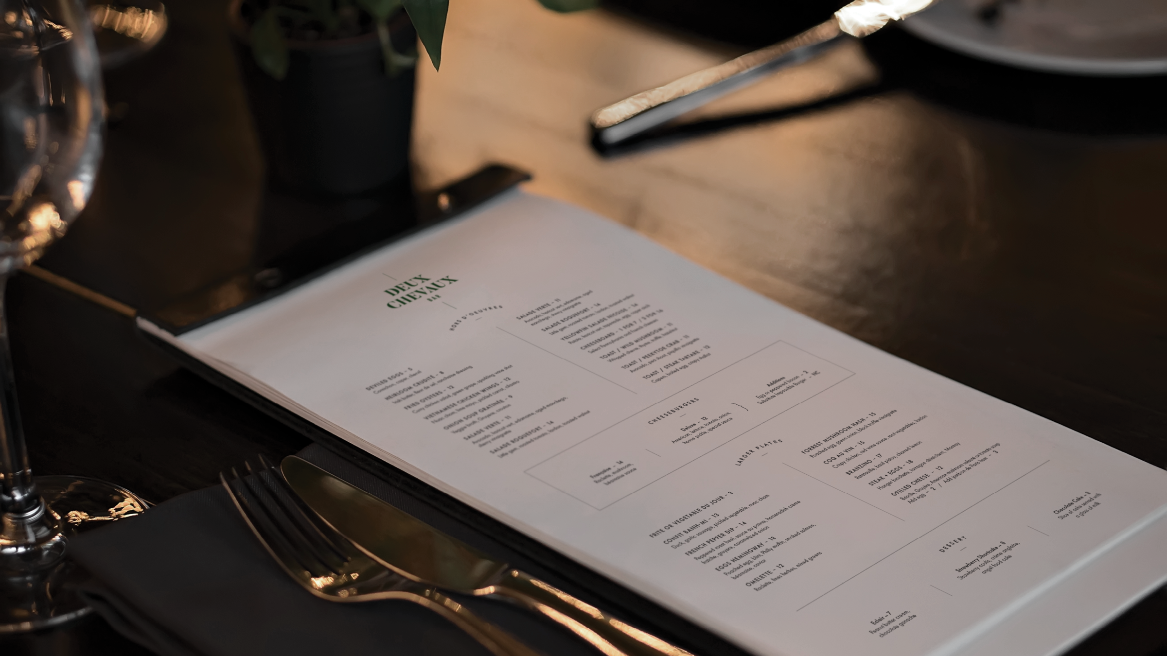
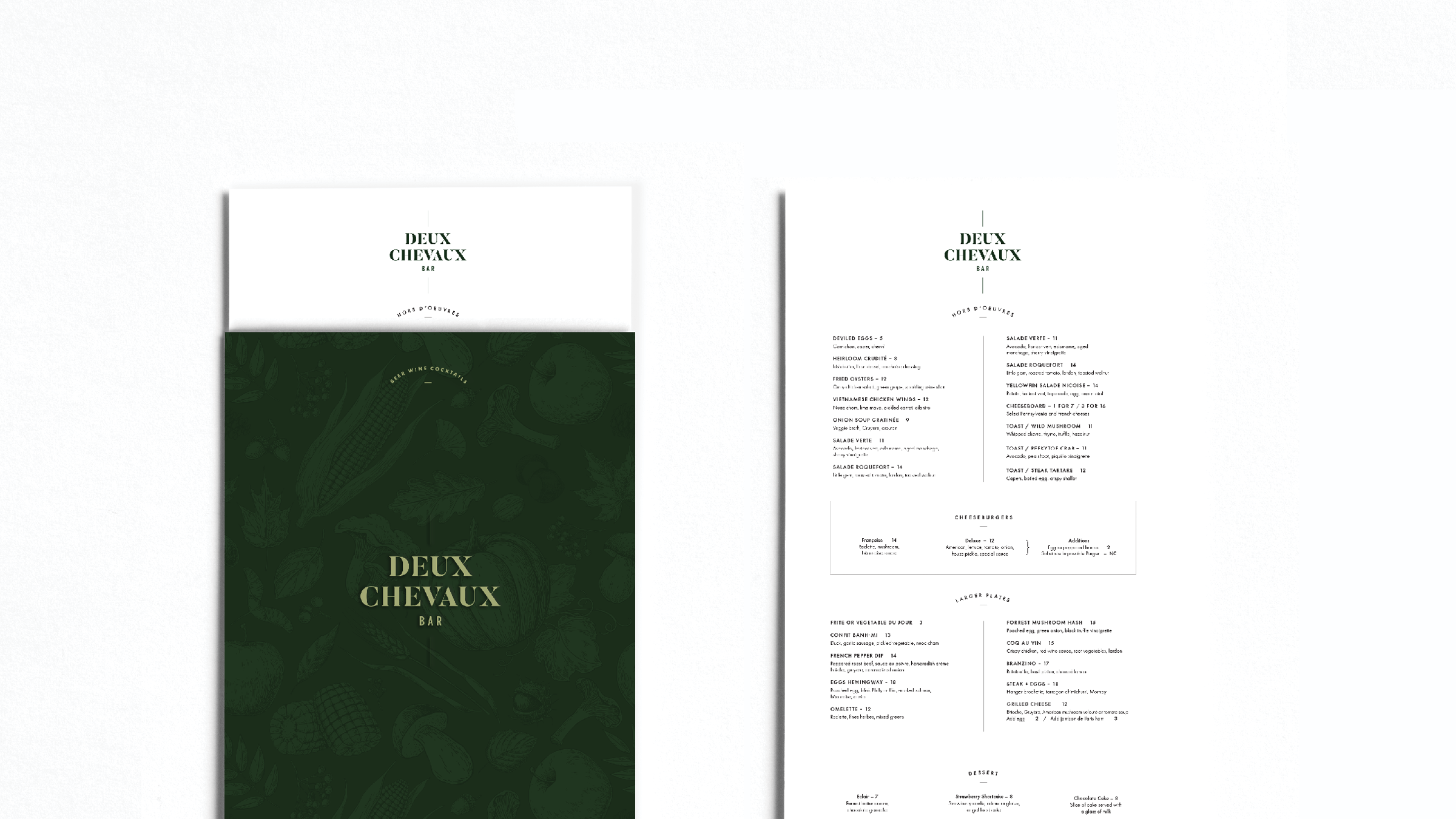
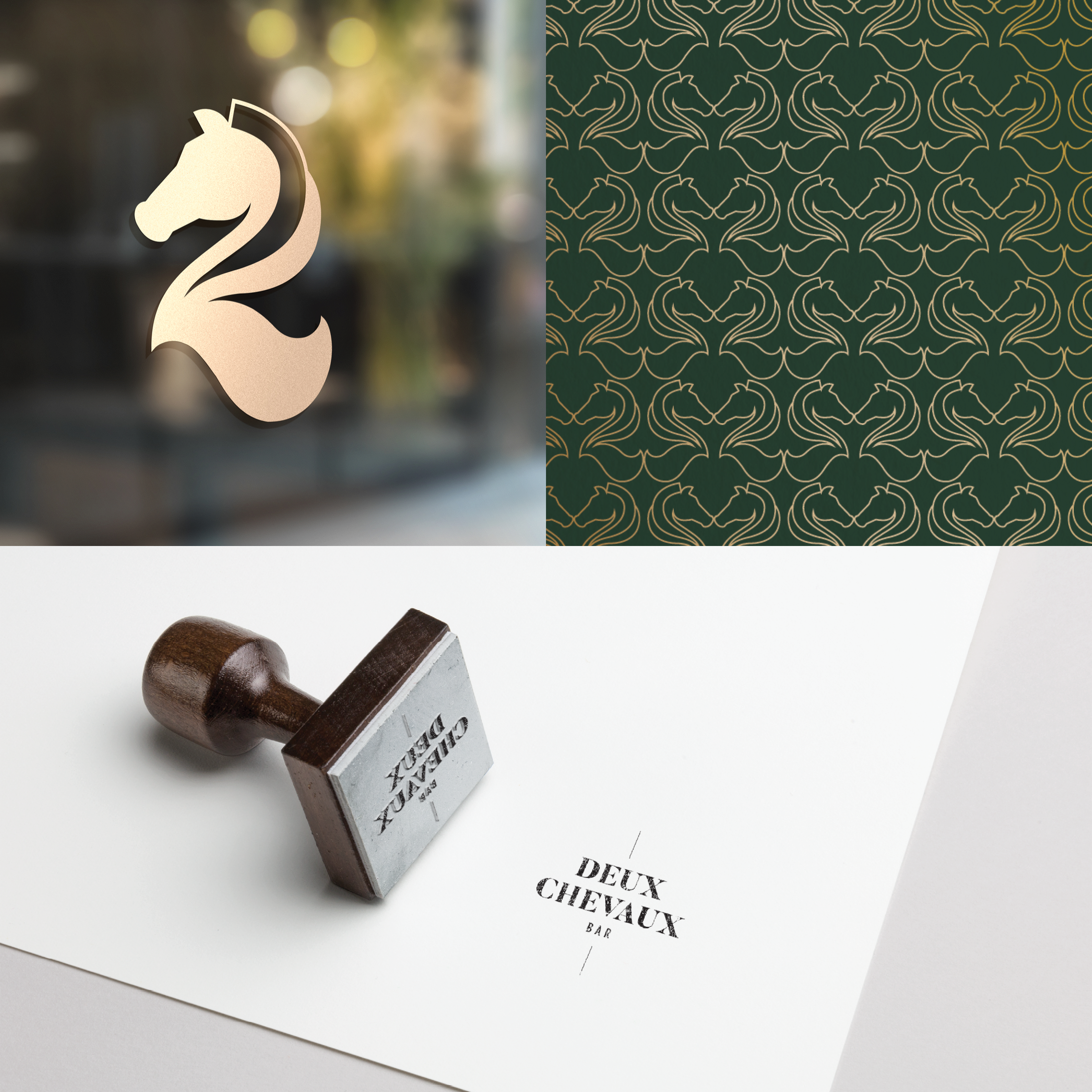
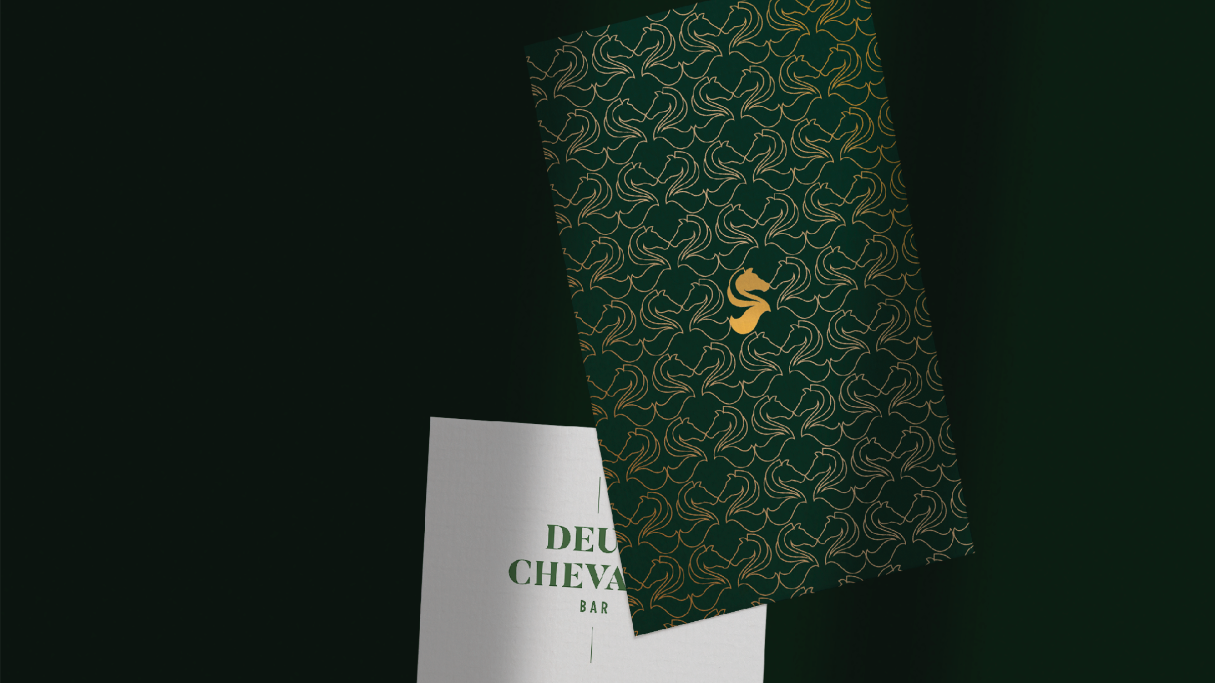
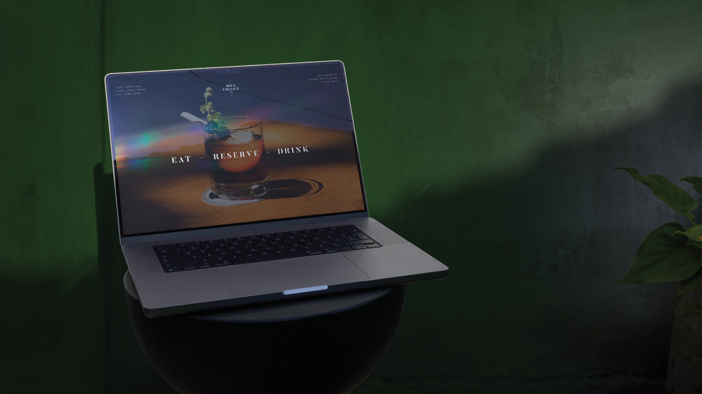
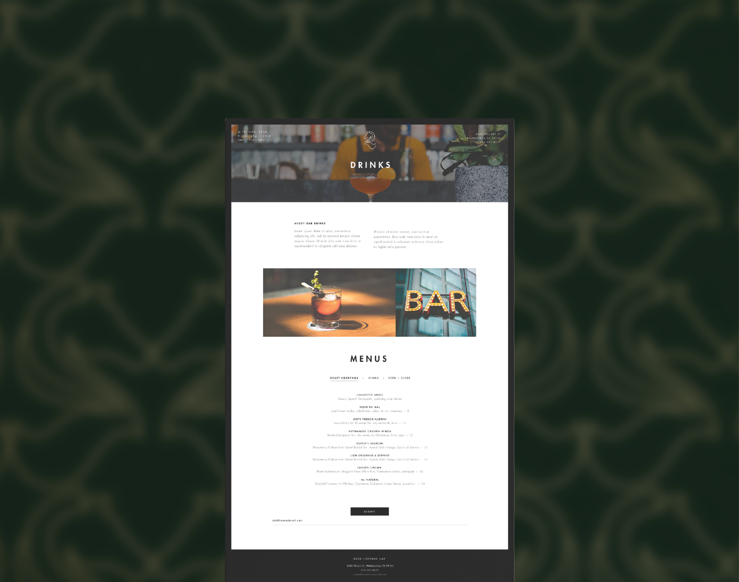
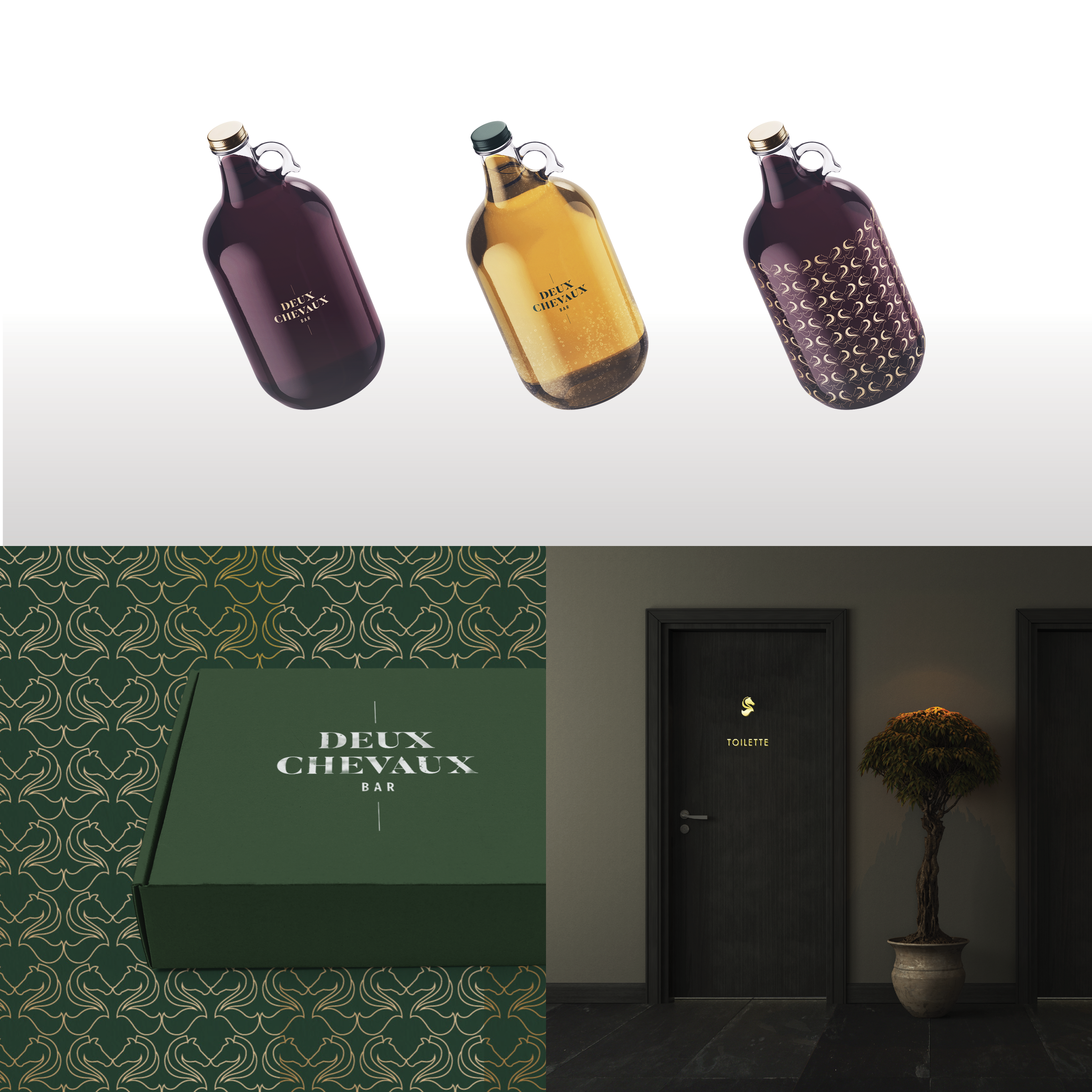
Deux Chevaux, meaning “two horses” in French, draws its identity from a symbol that merges the form of a horse with the number two. The custom mark reflects both the name and spirit of the restaurant—elegant, distinctive, and rooted in French inspiration.
The visual identity is anchored in a rich hunter green paired with refined gold accents. The deep green evokes tradition, depth, and sophistication, while the gold adds a sense of understated luxury. The palette creates an atmosphere that reflects the elevated yet welcoming dining experience.
BISOU
VISUAL IDENTITY/
BRAND COLLATERAL/
SIGNAGE/
INTERIOR DESIGN/
PHOTOGRAPHY
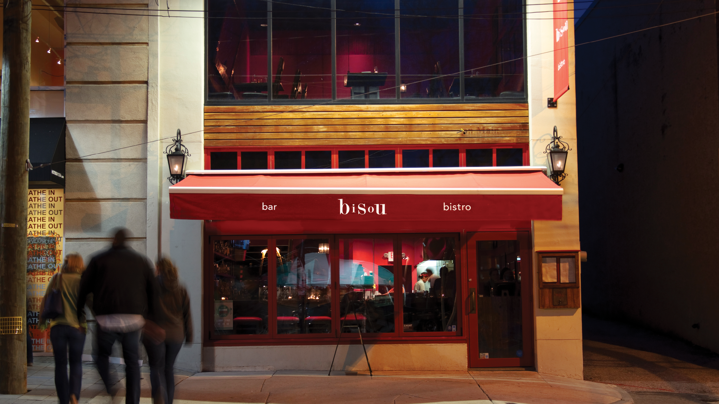
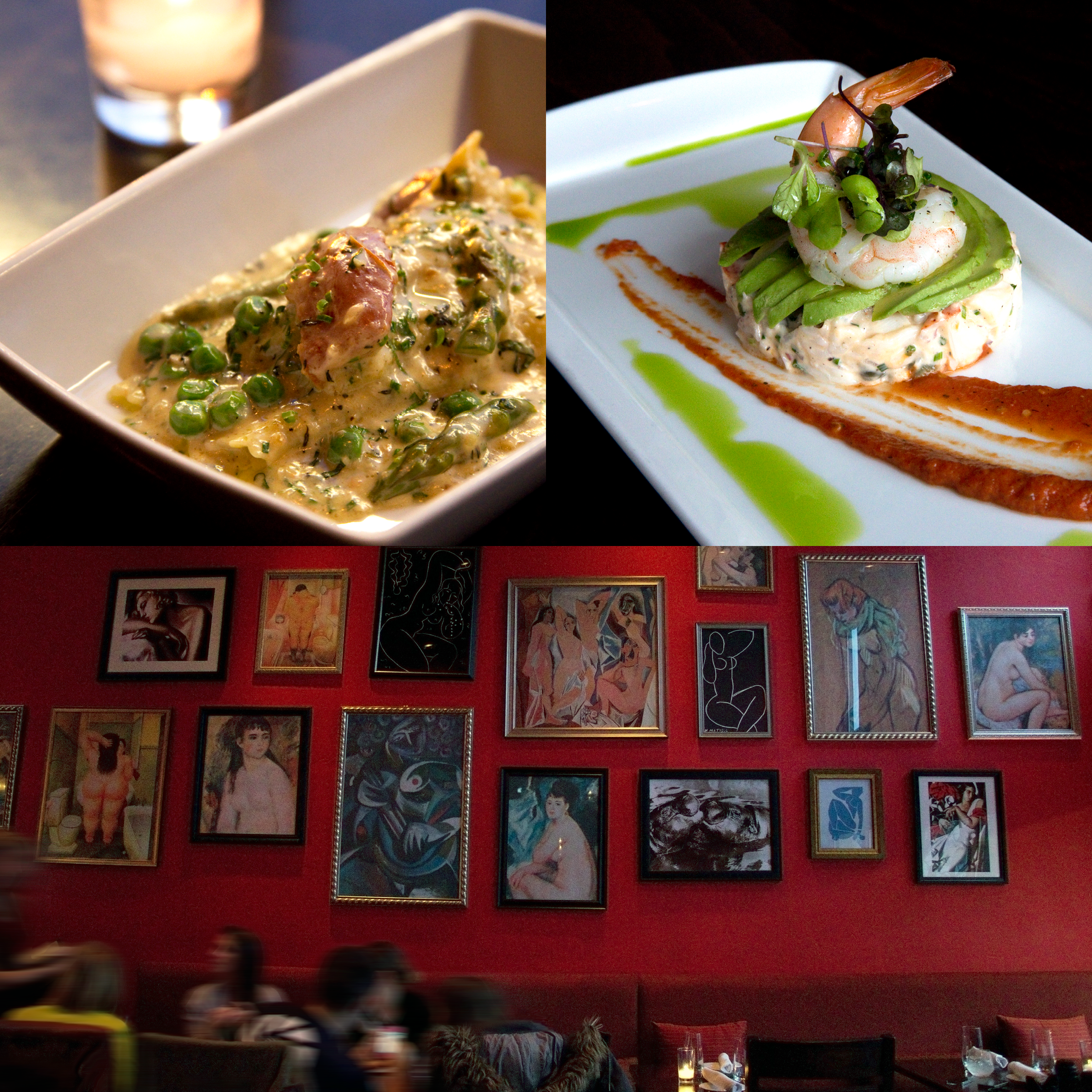
Bisou, the French word for kiss, inspired a brand identity centered on romance, playfulness, and the charm of French culture. At the heart of the identity is a whimsical logo that reflects the restaurant’s personality—elegant yet playful, with a touch of flirtation that mirrors the meaning behind the name.
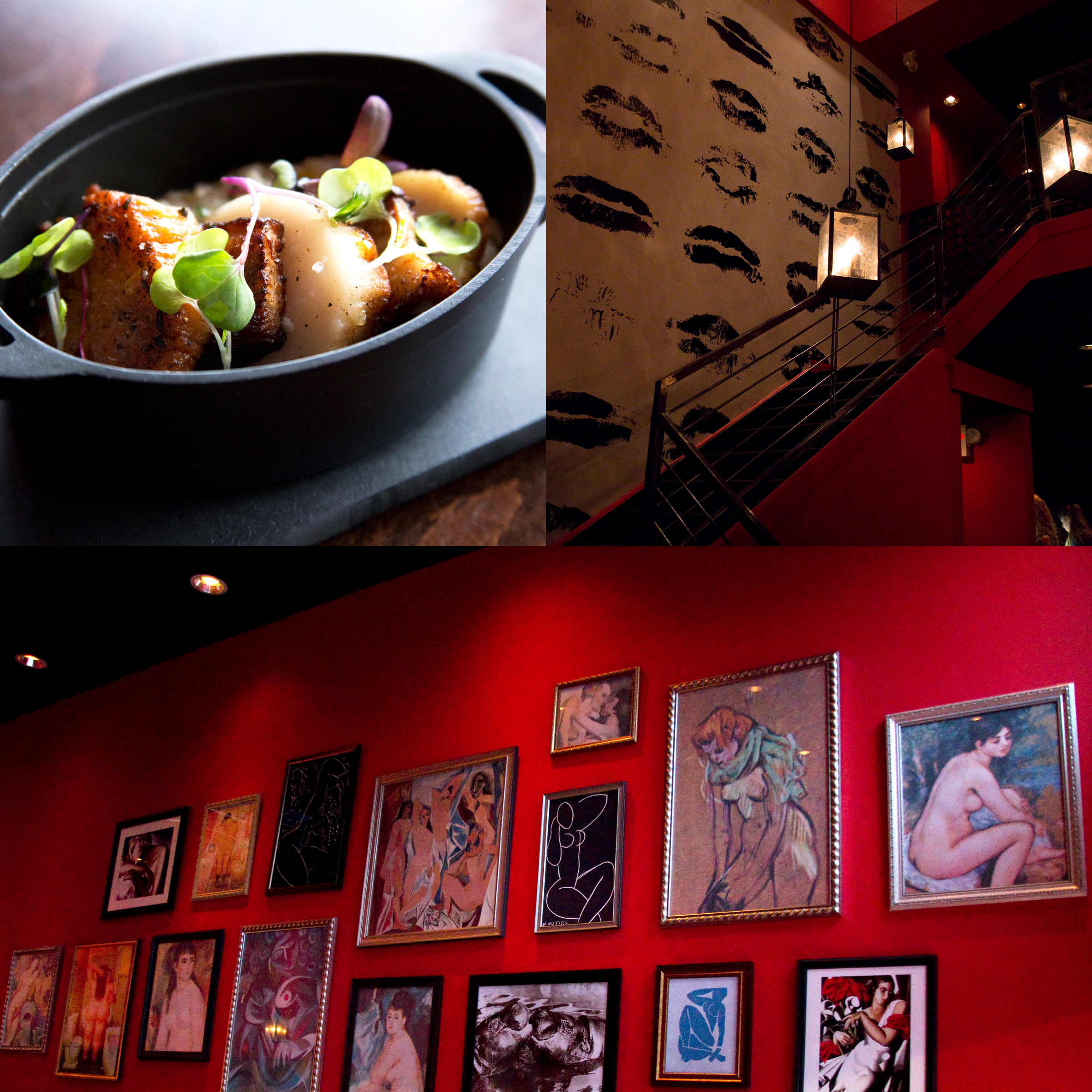
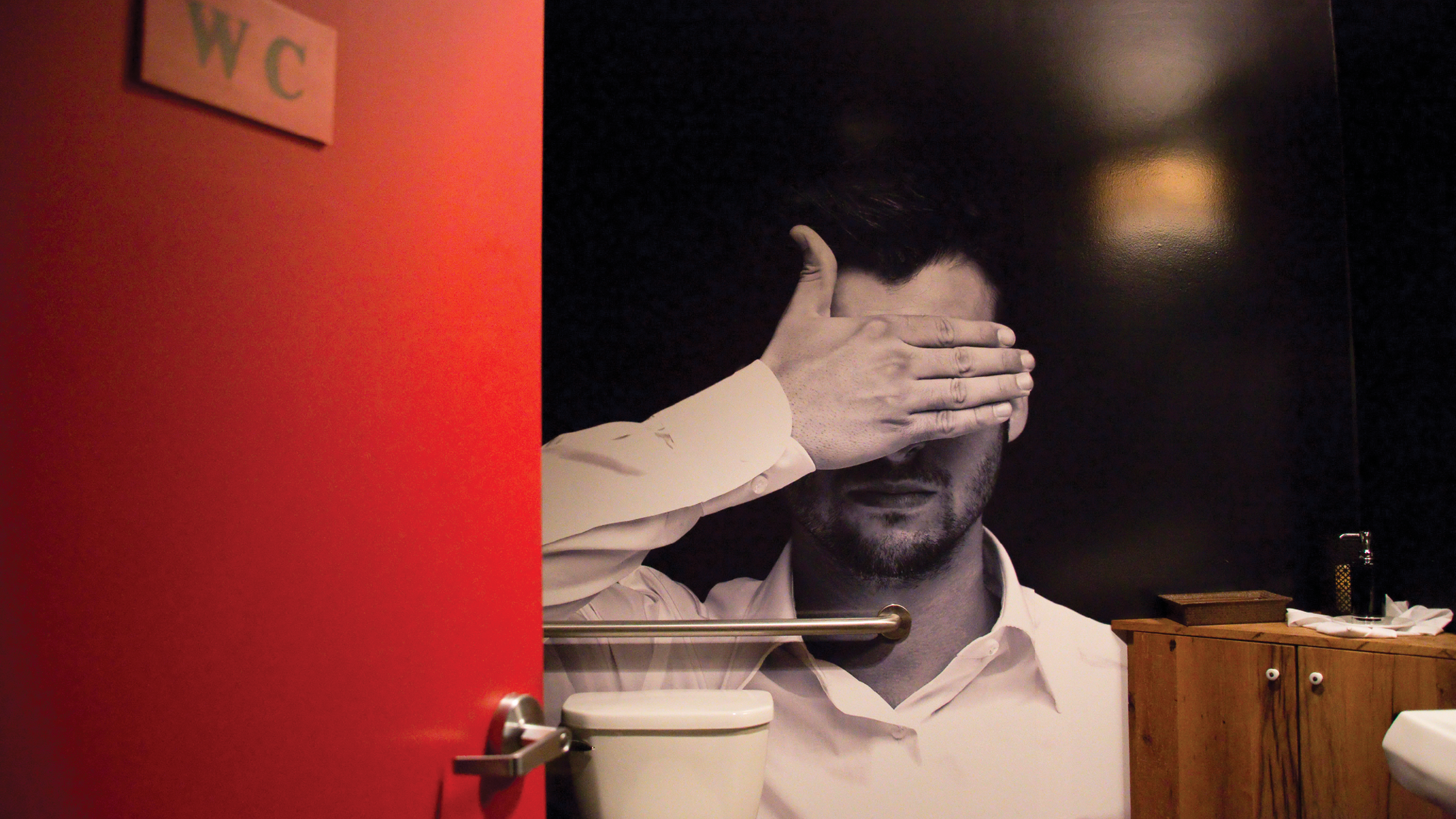
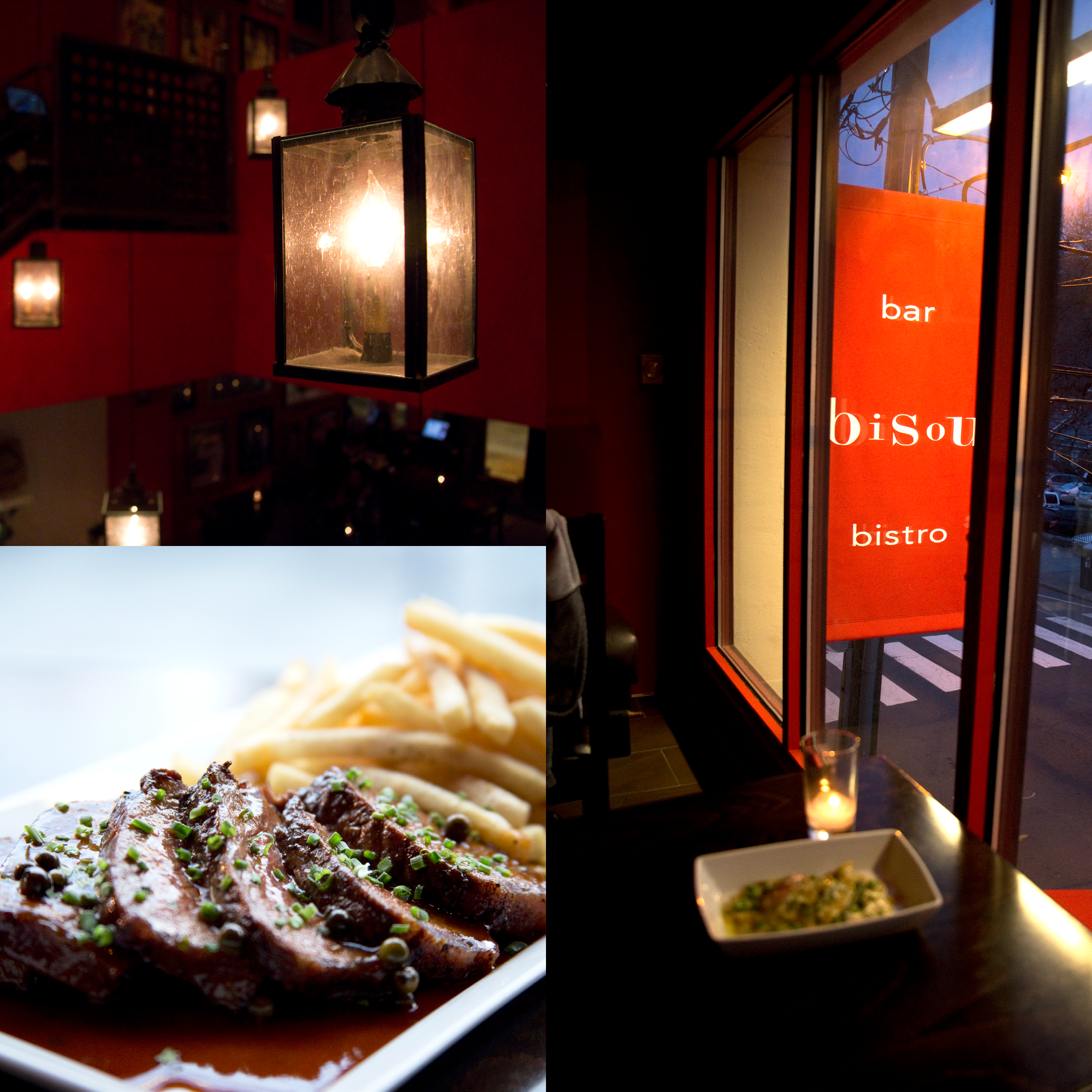
The interior graphics and environmental design extend this concept throughout the space. A prominent wall mural of kiss marks serves as a focal point, transforming the dining environment into an immersive expression of the brand.
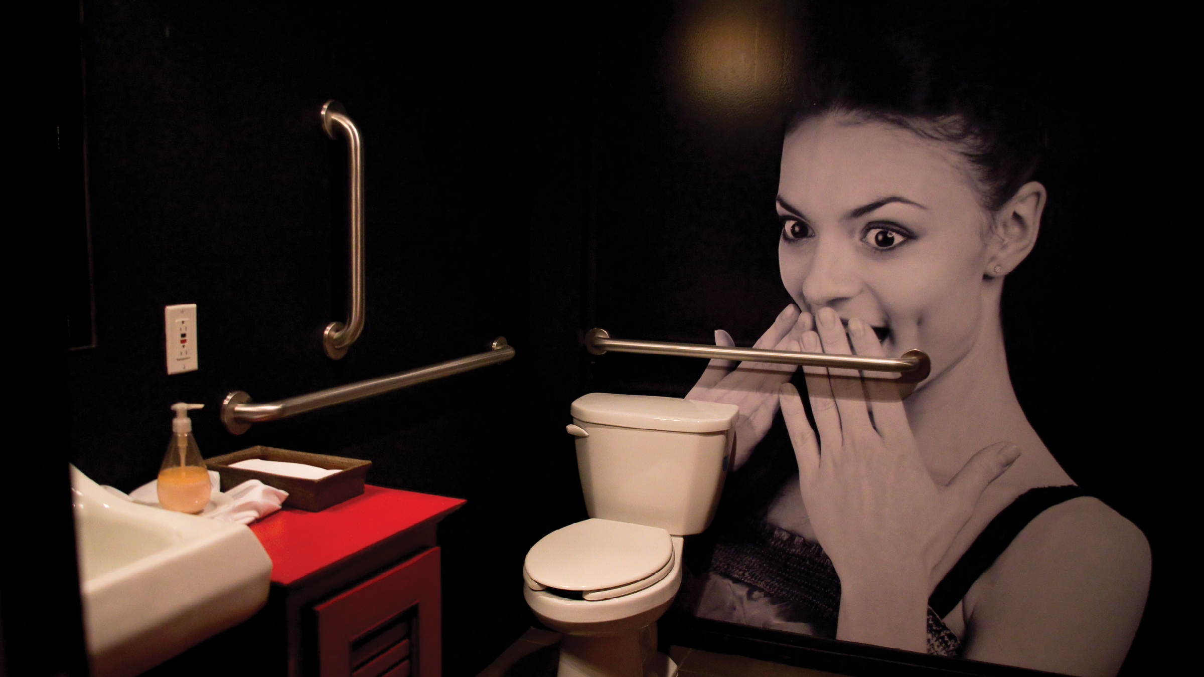
A bold, red-forward color palette anchors the identity. Red evokes passion, appetite, and romance—perfectly aligning with both French culinary culture and the symbolic gesture of a kiss.
Bisou is not just a place to dine, but a place to gather, celebrate, and share a little affection. 💋
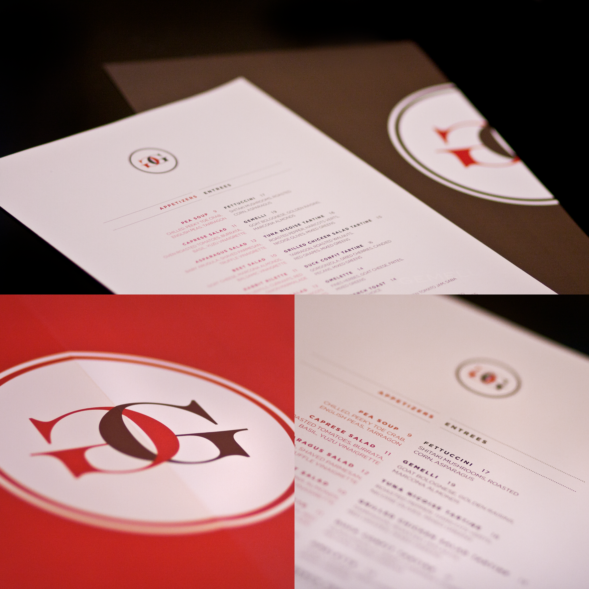
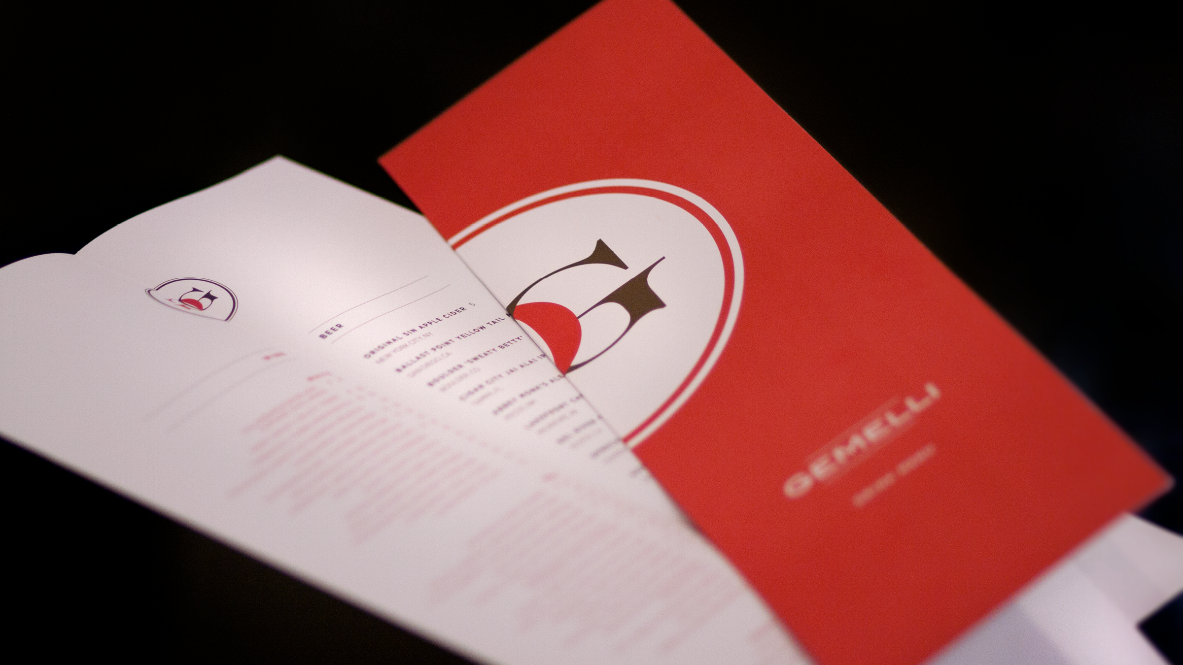
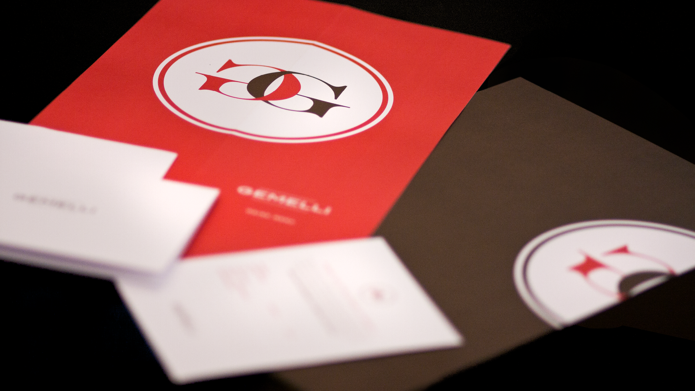
GEMELLI
VISUAL IDENTITY/
STATIONERY/
BRAND COLLATERAL/
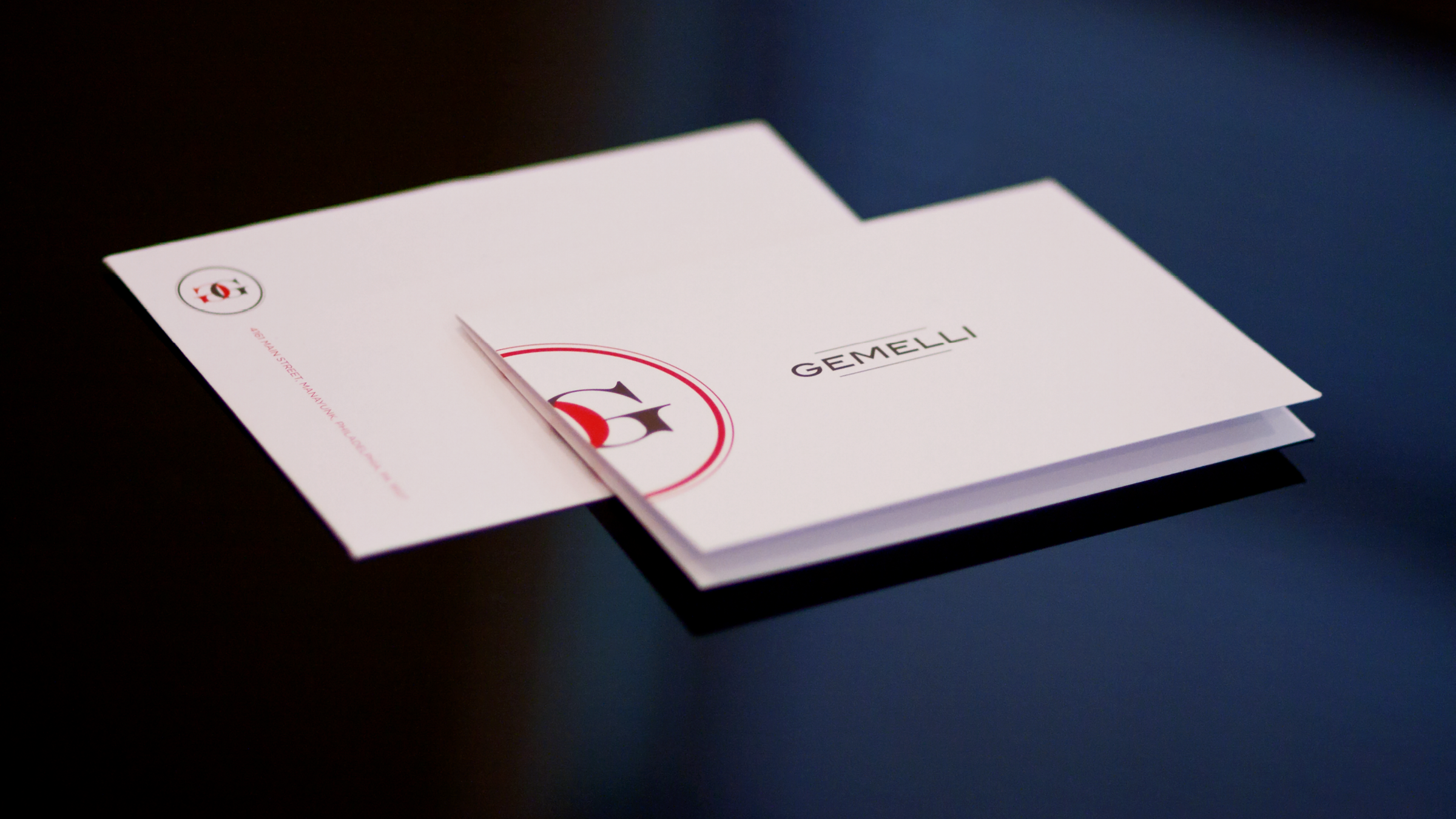
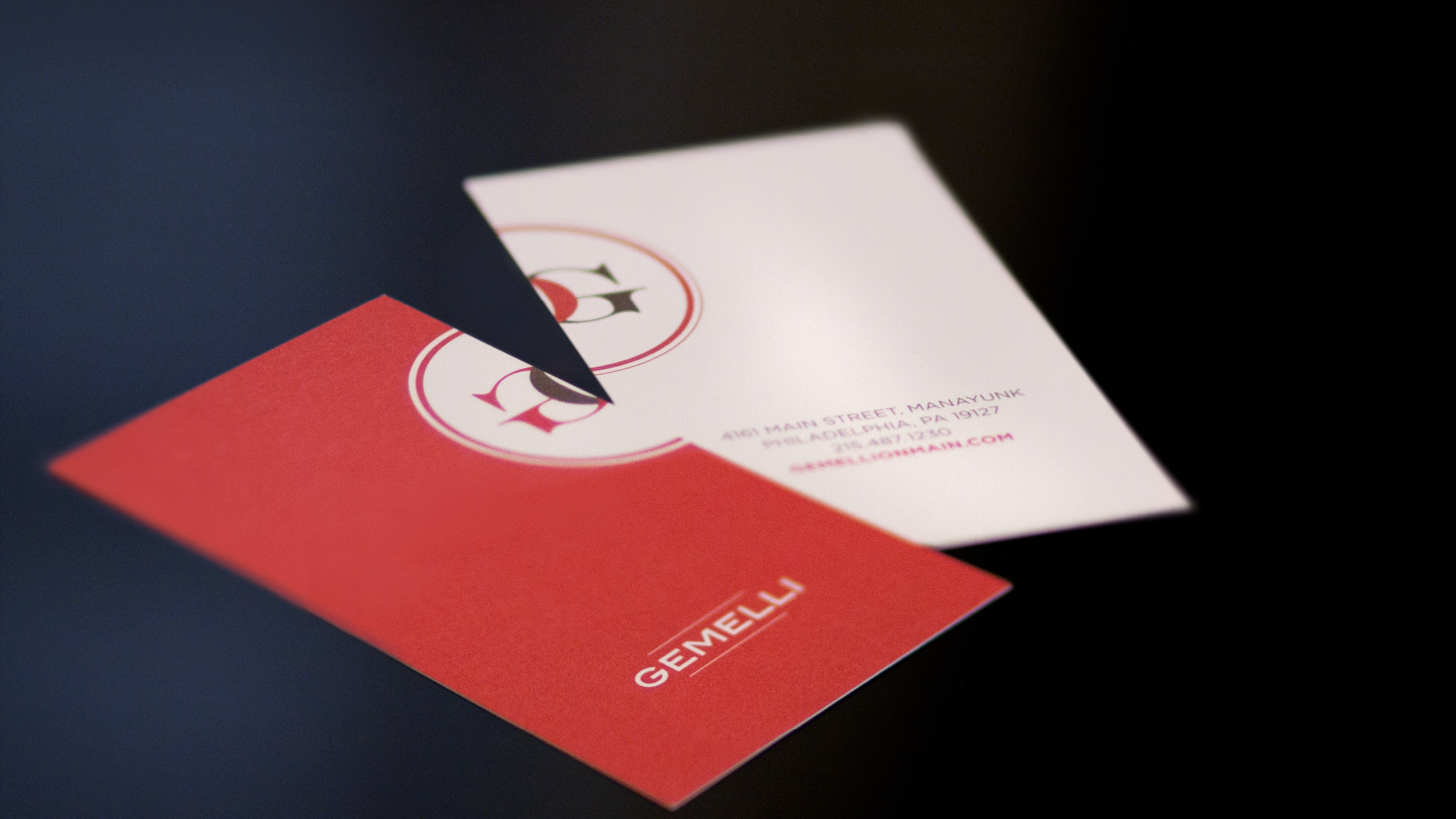
Gemelli takes its name from the short, twisted pasta shape that resembles two strands intertwined. In Italian, gemelli also means “twins”—a meaning that sits at the heart of the restaurant’s story. Founded by a father inspired by his twin son and daughter, the brand celebrates connection, family, and the simple joy of sharing a meal together.
This idea of togetherness is woven directly into the visual identity. The logo features two interlocking G letterforms, echoing the intertwined form of gemelli pasta while symbolizing the bond between the twins. Just like the pasta shape itself, the forms wrap around one another in a gesture of unity—distinct yet inseparable.
Gemelli’s identity reflects the warmth of family traditions and the craft of Italian cooking: thoughtful, playful, and rooted in connection. Every detail—from the name to the mark—tells a story of two becoming one, much like the strands of pasta that inspired it.
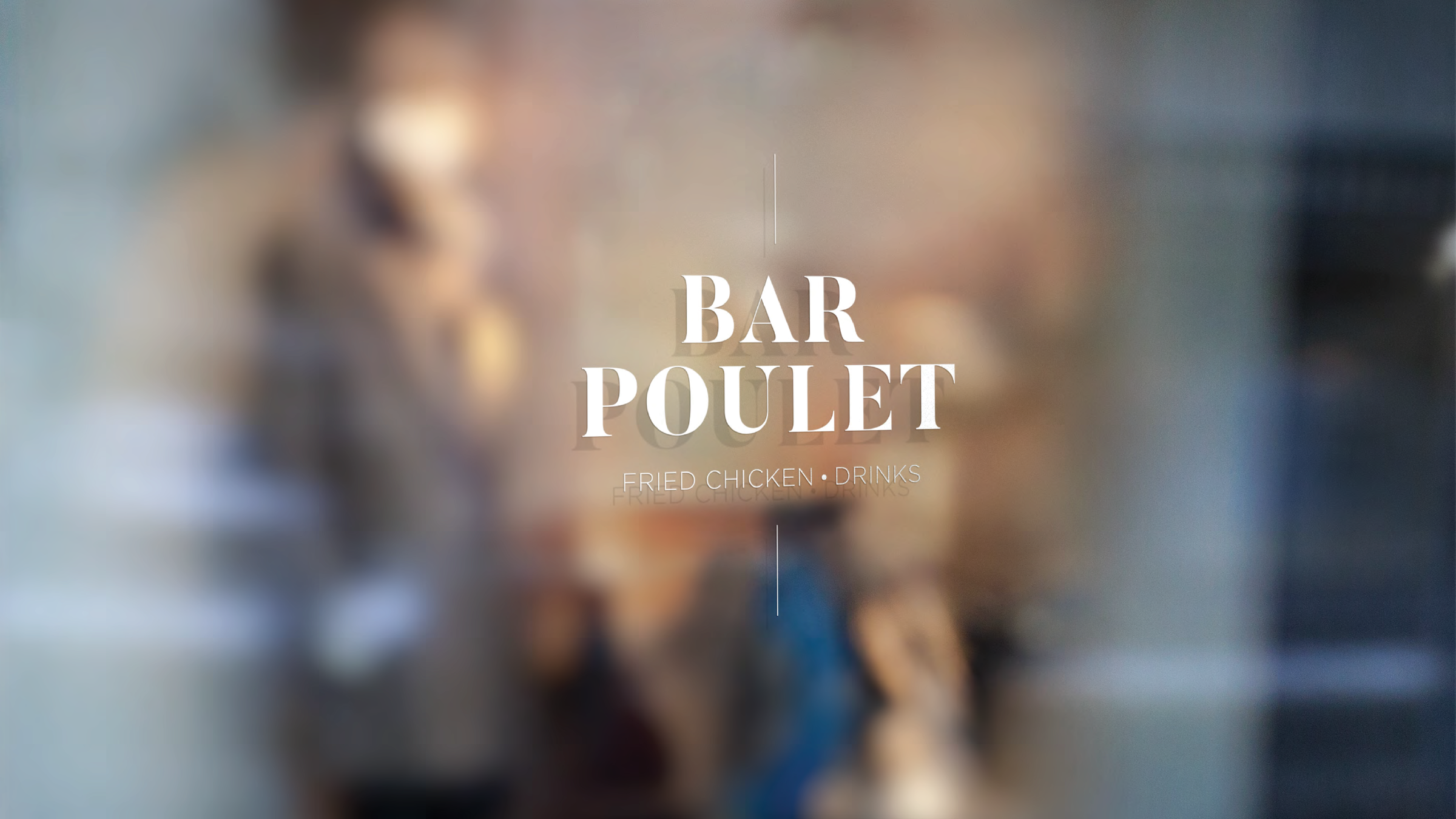
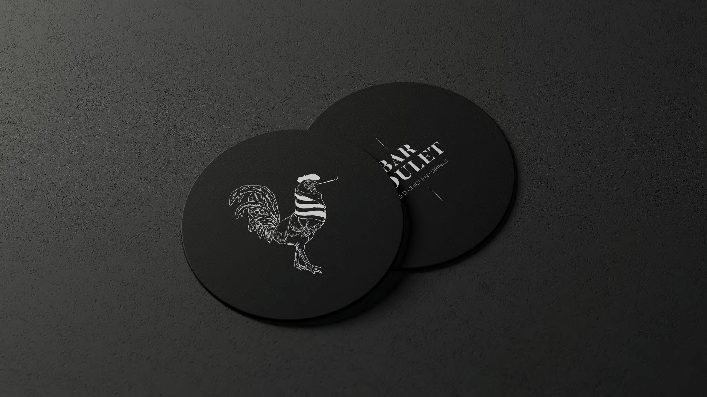
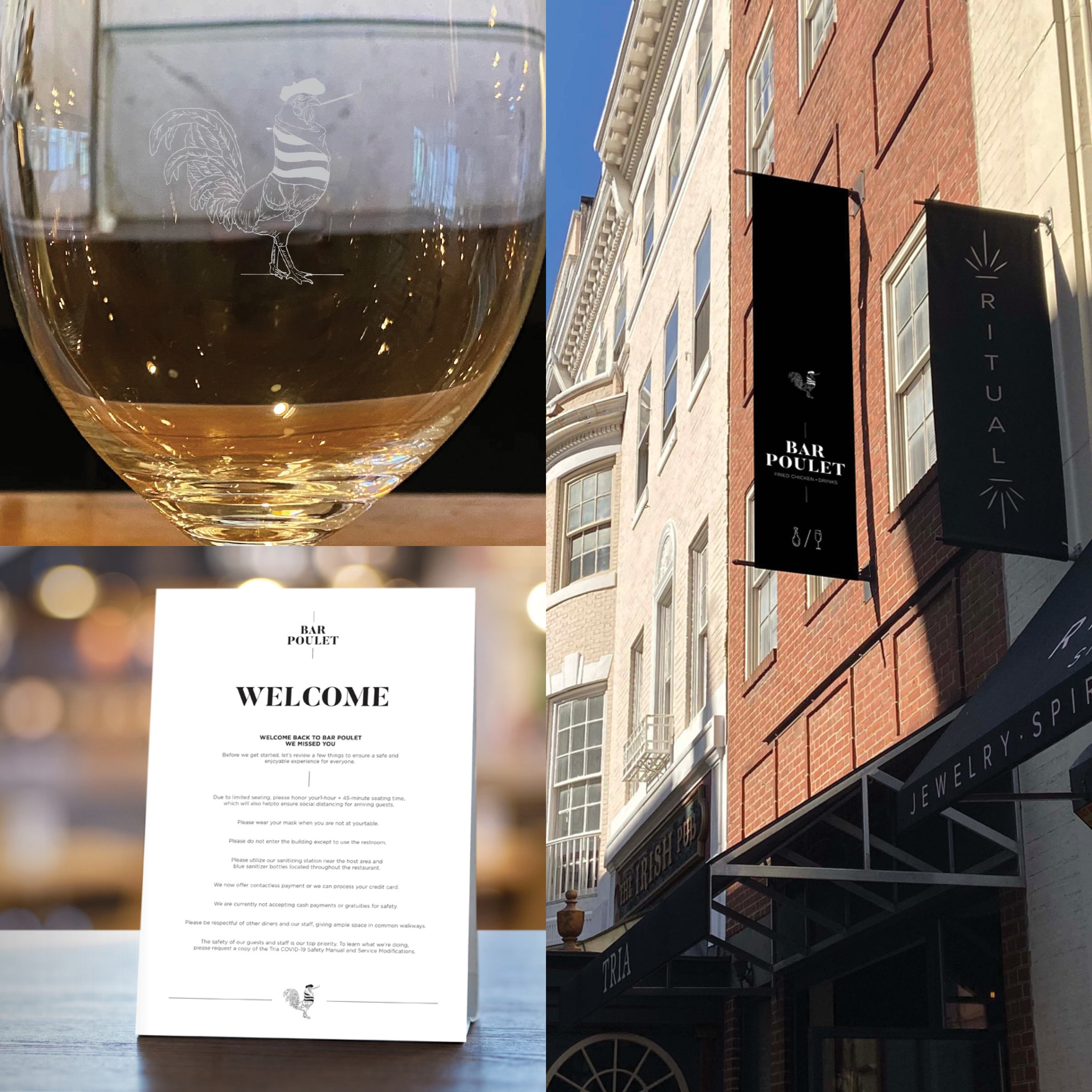
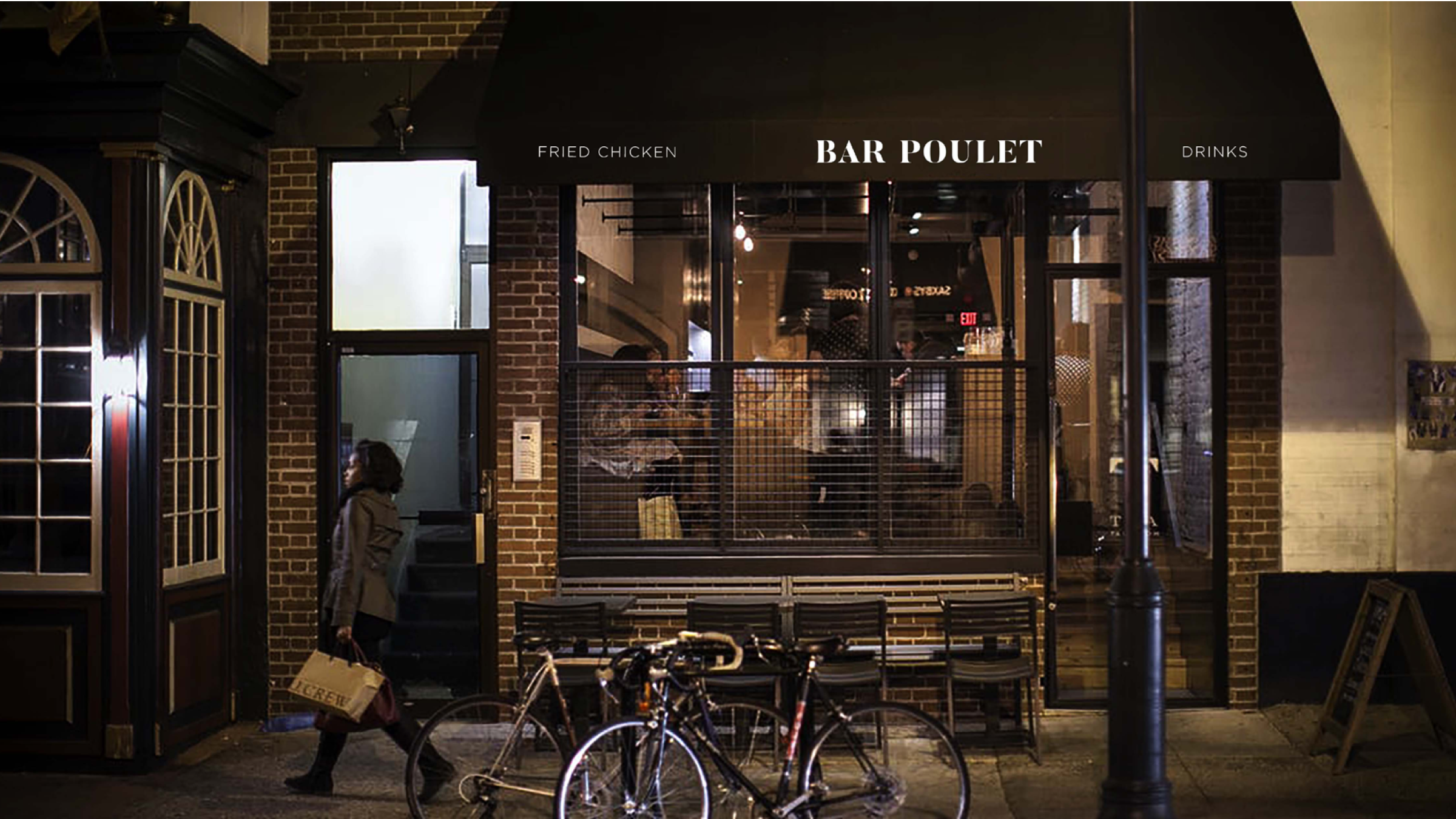
BAR POULET
VISUAL IDENTITY/
STATIONERY/
BRAND COLLATERAL/
SIGNAGE
Bar Poulet celebrates the essence of French sophistication while embracing the fun and comfort of indulgence. This is a place where luxurious Champagne meets crispy, golden fried chicken—a pairing that may seem unconventional, but once experienced, becomes an unforgettable culinary revelation.
Bar Poulet honors tradition while pushing boundaries with a bold, modern twist. It’s the charm of a Parisian bistro, mixed with the joyous surprise of Southern comfort food, served with a glass of the finest Champagne. A blend of indulgence, class, and unexpected delight.
Pierre the French Rooster
Pierre is the embodiment of French flair and boldness. He is illustrated in a playful, but sleek and elegant style. He underscores Bar Poulet’s chic and sophisticated atmosphere.
CREDITS
Design Direction / Design: Don Wilmer
Design: Danielle Cerceo, Louie Greco
Photography: Danielle Wilmer